

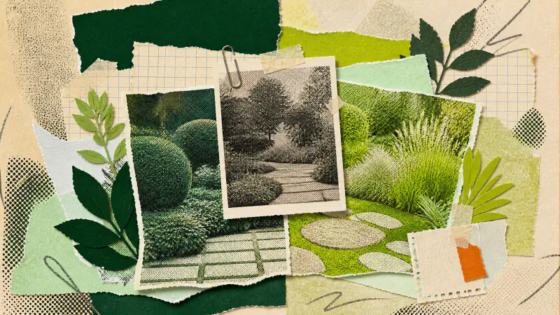
The fairest way to compare two AI landscape design directions is to keep one source photo fixed and change only the style. Judge both images against the same short list: route, open ground, planting mass, focal point and relationship to the existing house. Otherwise you are comparing two different questions and calling one answer better.
This is a choice between visual directions, not a test of which image looks most polished. The useful winner is the one that gives you clearer decisions to carry into a measured plan or a conversation with a landscaper.
Start with a contrast that answers one question
Choose two directions that disagree in a useful way. You might compare a spare, geometric treatment with a looser planted one because you are unsure how much open ground to keep. Comparing two near-identical styles usually produces a hunt for tiny differences in furniture and flowers.
Write the question down before generating anything. "Do we want one broad planted edge or several smaller beds?" is better than "Which one is nicer?" A narrow question gives you something you can check in the real garden later.
Gardenly has a gallery of design styles. Pick two with an obvious difference in structure or material mood. Avoid choosing a deliberately transformative style such as Sketch, Cyberpunk, Post-apocalyptic, Ski Chalet or Medieval for this exercise, since those can rework the building as part of their effect.
Keep the source photo fixed
Use the exact same photo for both versions. The viewpoint, weather, time of day and visible clutter then stay constant, so the style is the main variable. If the second image starts from a tidier photo or a wider angle, its extra appeal may have nothing to do with the design direction.
Choose a view you use in daily life and keep the important boundaries visible. The yard photography guide covers viewpoint and light in more detail. Save the original beside both results. Gardenly instructs the image model to leave the house, hardscape, camera position and lighting unchanged, but that is an instruction, not a guarantee.
Compare the same five decisions
Do not let one striking plant or chair decide the result. Put the two versions side by side and look at the same parts in the same order:
- Does the daily route remain obvious and comfortably open?
- How much ground is left open, and does that space have a job?
- Are the main planting areas deep, narrow, scattered or grouped?
- What holds your eye first, and is that where attention belongs?
- Does the garden sit comfortably beside the existing house and paving?
Check the original after each question. A boundary, path edge or door can drift in a generated image. If one version depends on that change, mark the idea as uncertain rather than awarding it a point. Our detailed guide to checking an AI garden design against the house gives you a practical inspection order.
Name what the winner gets right
You do not need to copy the winning image. Write down three or four relationships worth keeping: one deeper border along the back, less furniture near the door, a stronger planted edge around the seat, or a quieter material change at the path. Those notes are more useful than "version B feels better."
Separate the broad idea from invented detail. A render cannot know your soil, drainage, climate, underground services or mature plant sizes. It also cannot supply reliable construction dimensions. The plant-choice workflow for an AI landscape design tool shows how to turn visible height, density and texture into a site-aware planting brief.

Carry one direction forward
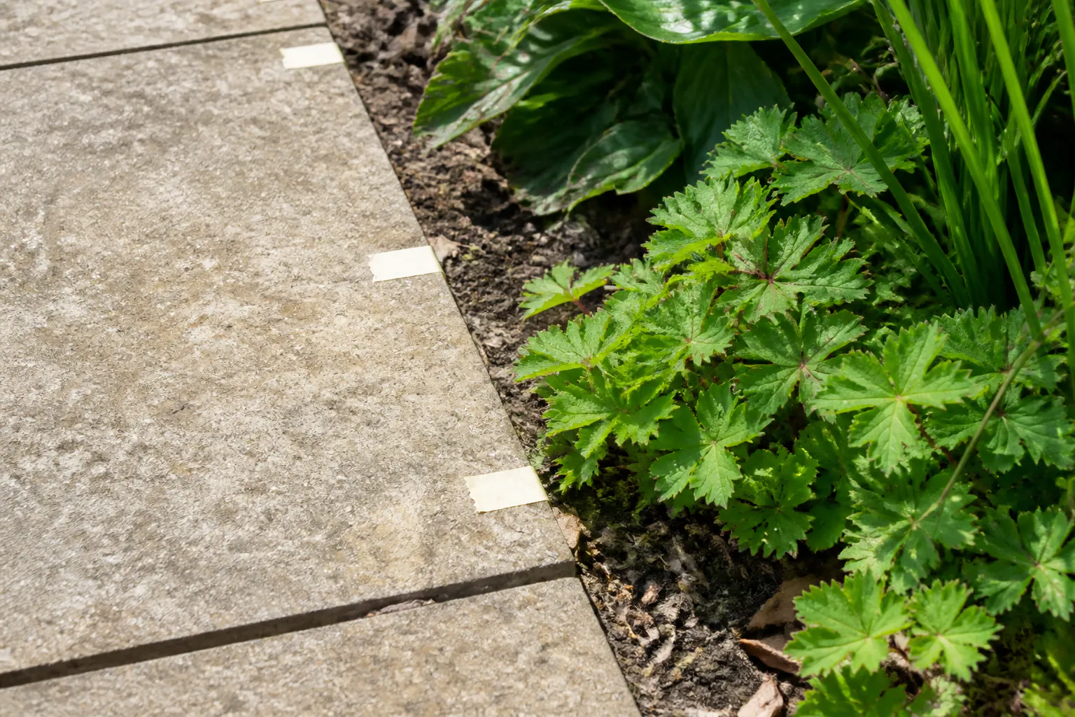
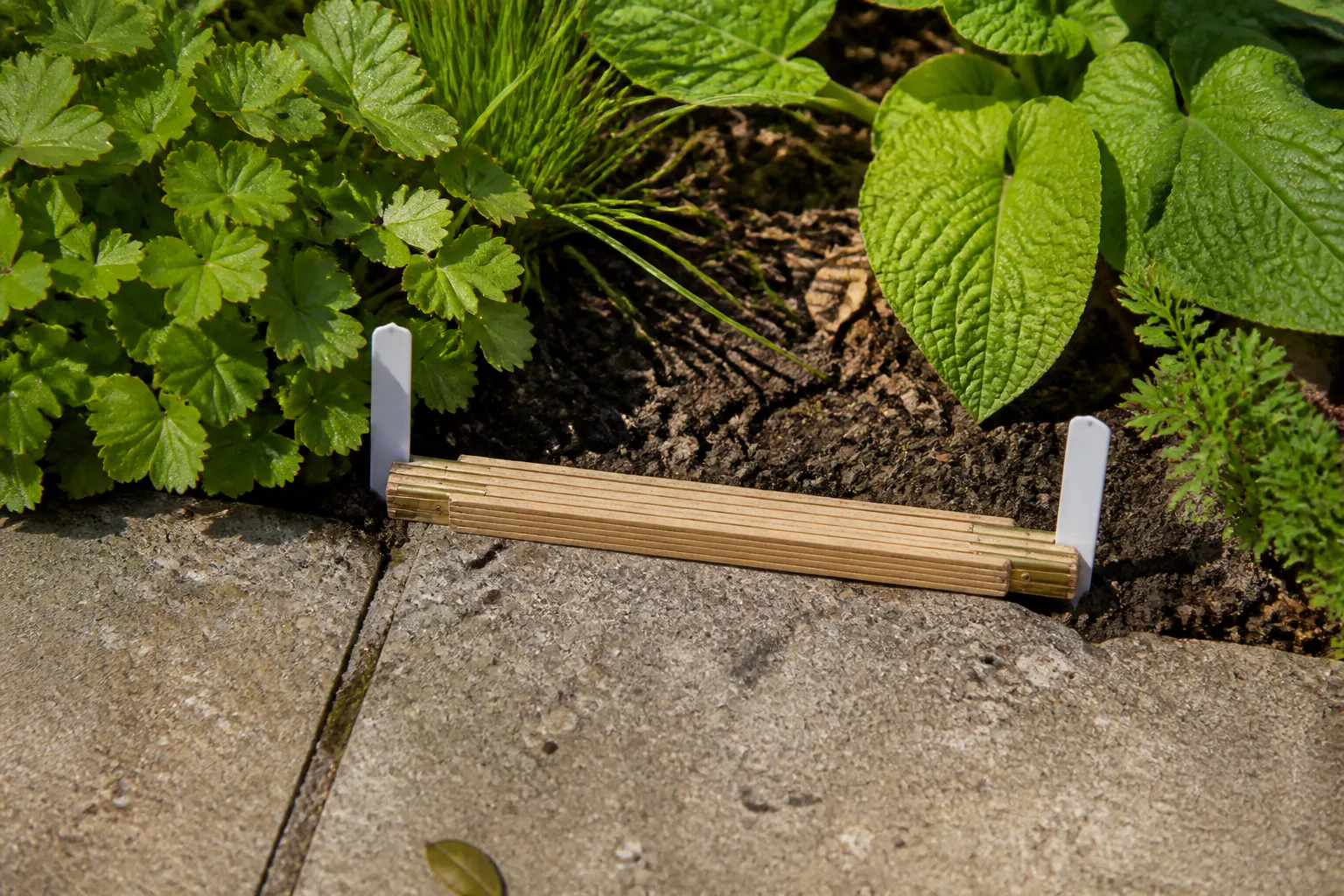
Keep the original photo, the preferred version and your notes together. Add real measurements where a route, seat, bed or step matters. If the comparison remains close, return to the question you wrote at the start and test one physical choice outside with chairs, pots, string or removable tape.
Take that small pack to a garden designer, landscaper or nursery. It communicates the visual direction while leaving site checks, plant selection and construction planning to people who can inspect the place. The rejected image has done its job too: it showed which tradeoff you do not want to make.