

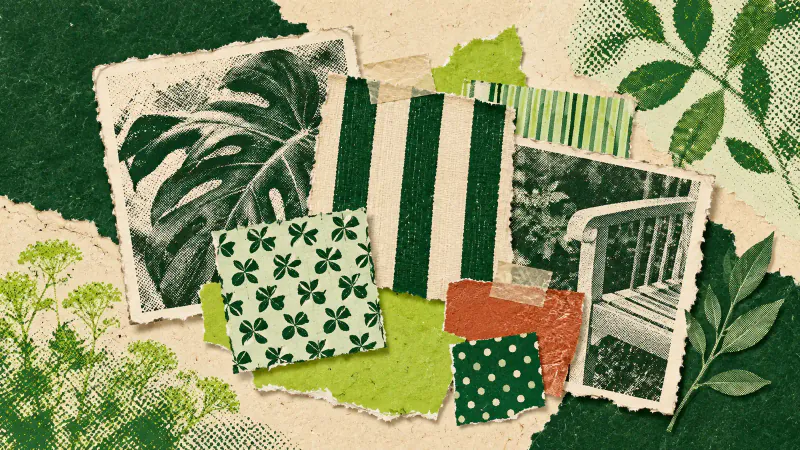
Start with bohemian garden ideas that connect things you already own: repeat a strong colour, combine patterns of different sizes and let a few varied objects earn their place. An existing bench or plain paved corner gives you somewhere to try the look before changing a whole garden.
Gardenly describes its Bohemian style as "Free-spirited with bold colors." Take that as permission to make a confident colour choice. You can get there with a patterned cushion and a related pot; you do not need to collect every object sold under the word boho.
Choose a colour you can repeat
Look at the fixed background first. Red brick, grey paving and a dark fence already occupy large parts of the view. Put your preferred colour beside those surfaces before deciding whether it belongs. A blue you like indoors might feel quite different against the brick outside.
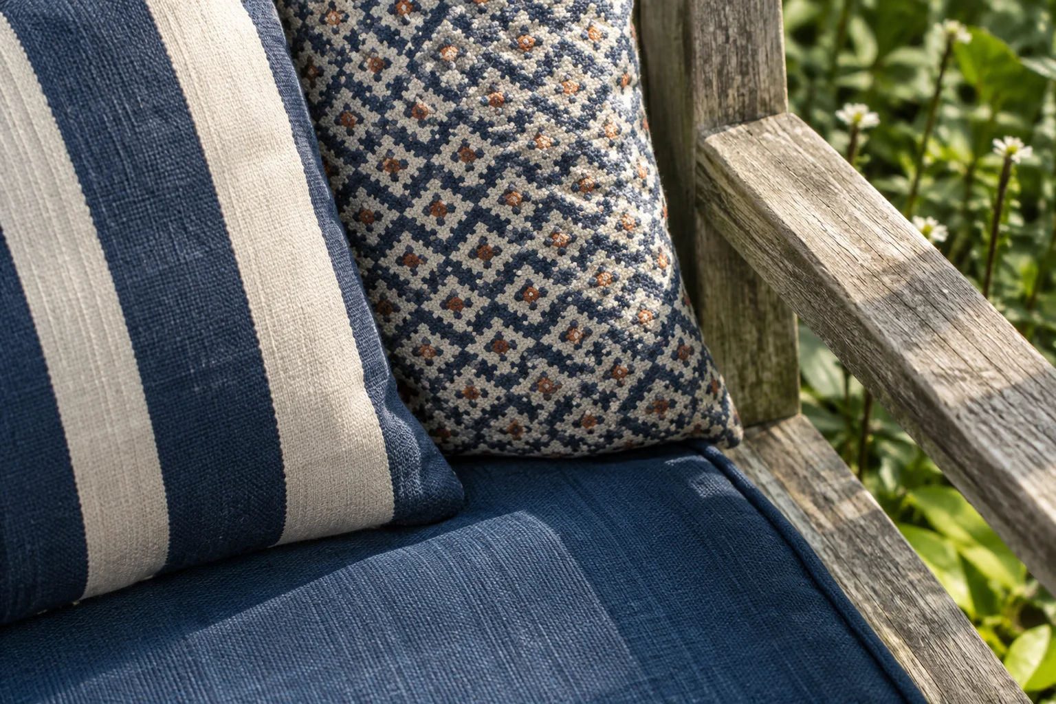
Use one existing object as a starting point: perhaps a blue cushion you still enjoy or a terracotta pot with an unusually warm tone. Repeat part of that colour elsewhere, with one larger area and one smaller accent. A broad blue seat cushion can relate to the narrow blue stripe on another fabric without matching it exactly.
Keep the trial small enough to undo. Set the objects in place, stand at the doorway and see which one catches your eye first. If every colour seems to shout at once, remove one accent and look again. More colour can come later, once the first combination feels comfortable.
Mix pattern sizes around a plain surface
A wide stripe and a small geometric print give the eye different things to read. Two busy prints with similarly sized marks can compete, especially when they sit directly beside each other. Try changing the scale before giving up on either pattern.
Pick a shared colour from the fabrics, then leave a plain area nearby. That could be the bench timber or an unpatterned cushion. The plain surface helps you see the shapes in the prints and makes the repeated colour easier to spot.
Check from your usual sitting distance as well as close up. A tiny pattern that looks sharp in your hand may blend into one tone from the kitchen door. If you mostly see the seat from there, judge the combination from there. You are arranging a place you use, not a photograph taken six inches from a cushion.
Give varied objects a clear place
Different finishes can sit together when their arrangement has a reason. Put a favourite glazed pot where its colour relates to the nearby fabric, while keeping it out of the way of a chair being pulled back. Let an existing side table remain useful instead of covering it with decorative objects.
Try one distinctive piece at a time. A handmade-looking pot beside a plain seat may be enough to change the character of that corner. It need not come with matching lanterns, tassels and a wall hanging. Keep an object you love even if it breaks your palette slightly; repeat a small part of its colour nearby if it feels isolated.
For a softer direction, the Cottagecore garden guide works with muted flowers and loose planting. Here, the main decision is how stronger colours and patterns relate across the things already in the view. You can leave the planting arrangement alone while trying that change.
Take the samples outside
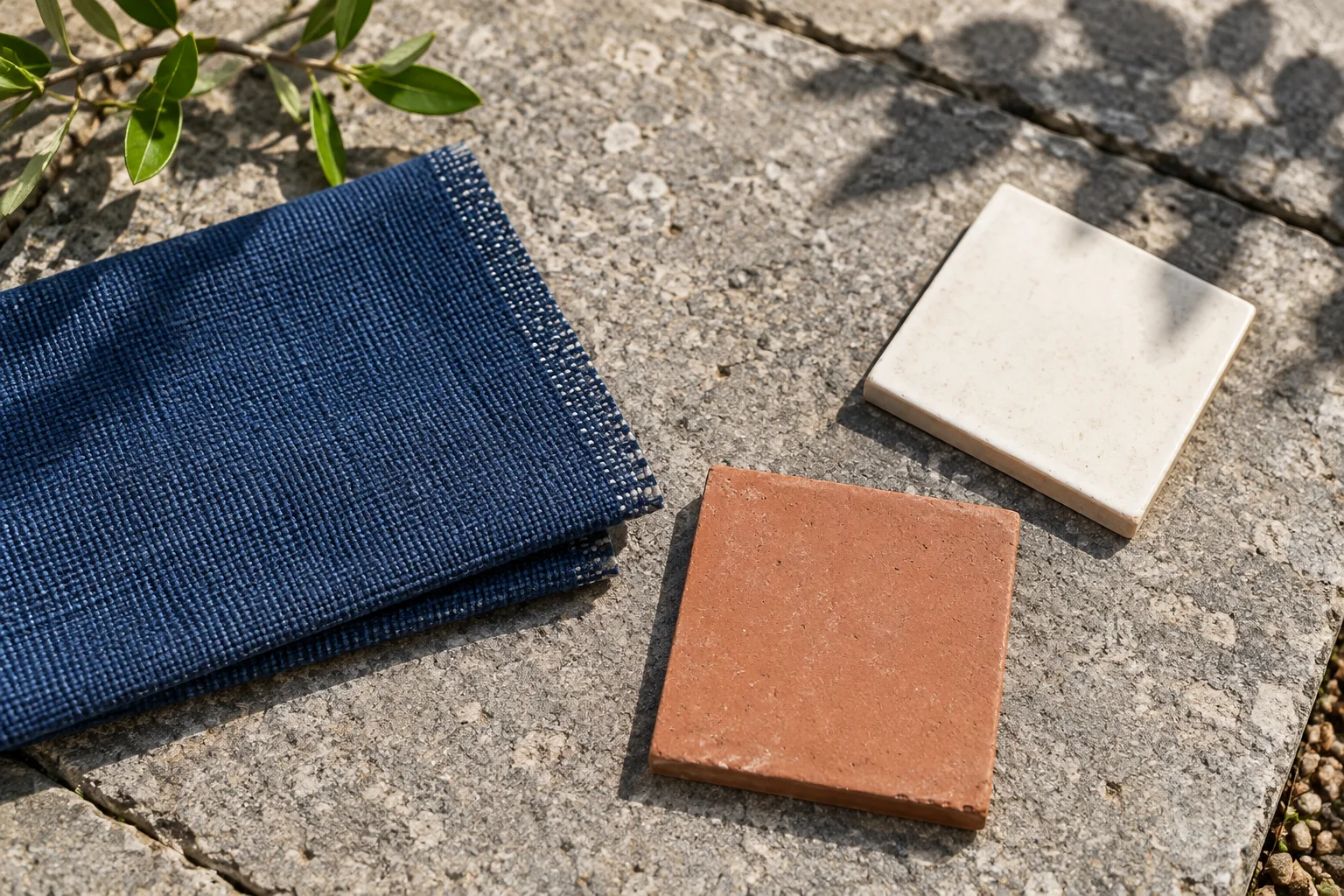
Bring actual fabric and finish samples to the spot where you intend to use them. Place them beside the paving and look in sunshine and shade, ideally at the times you normally sit outside. Photographs are useful notes, but make the final colour decision with the materials in front of you.
Include some existing foliage in the comparison. A green leaf beside the samples reminds you that the garden has colours beyond the objects you are adding. Do not buy a plant solely to complete the palette; its growing conditions still need to suit the site.
The colour test also gives you a chance to read the supplier's outdoor-use and care guidance. A fabric's appearance says nothing about whether it belongs outside. Keep sample trials temporary until you know what the material needs.
Preview the broad balance
Choose Bohemian in the Gardenly style gallery and use a photo of the existing garden to explore how much bold colour you want in the view. Treat the result as a broad visual suggestion. It cannot specify the exact fabric or colour match you tested.
The model is instructed to leave the house, hardscape, camera angle and lighting unchanged; that is not guaranteed. Compare the render with your original photo, then take one useful relationship back to the real materials: a larger area of colour, a smaller repeated accent or more plain space between patterns. Check that choice outdoors before committing to it.